### [如何实现小程序动画?小程序动画的实现方法](https://www.prosaas.cn/article/17017)
**Published:** 2018-11-10T08:40:43
**Author:** 5201314
**Excerpt:** 本篇文章给大家带来的内容是介绍如何实现小程序动画?小程序动画的实现方法。有一定的参考价值,有需要的朋友可以参考…
本篇文章给大家带来的内容是介绍如何实现小程序动画?小程序动画的实现方法。有一定的参考价值,有需要的朋友可以参考一下,希望对你们有所帮助。
在普通的网页开发中,动画效果可以通过css3来实现大部分需求,在小程序开发中同样可以使用`css3`,同时也可以通过`api`方式来实现。
**API解读**
小程序中,通过调用`api`来创建动画,需要先创建一个实例对象。这个对象通过`wx.createAnimation`返回,`animation`的一系列属性都基于这个实例对象。
**创建这个对象**
let animation = wx.createAnimation({
duration: 2000,
delay: 0,
timingFunction: "linear",
});
这个`animation`就是通过`wx.createAnimation`之后返回的实例。在创建过程中,可以给这个实例添加一些属性,如以上代码所示,等同于`css3`中`animation:$name 2s linear`的写法。
**添加动效**
实例创建完成之后,基于该实例,添加需要的动态效果,动态类型可以查阅文档得知,以最常见的移动,旋转为例:
animation.translate($width, 0).rotate($deg);
**结束动画**
`.step()`表示一组动画的结束
animation.step();
**导出动画**
动画效果添加完成了,如何给想要的dom添加动效呢。这里需要用到`.export()`导出动画队列,赋值给某个dom对象。
this.setData({ moveOne: animation.export() })
**例子**
以下将通过2组动画,来对比一下`css3`与`api`实现方式的不同。
**一、模块移动动画**
**动画效果:**
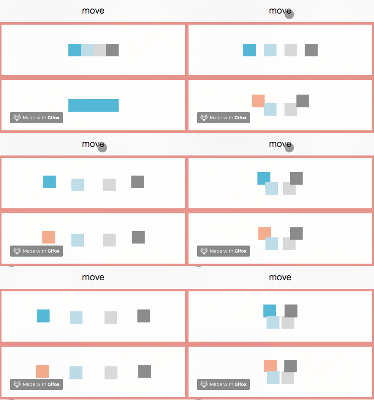
下图有两组动画,分别为`api`方式(上)与`css3`方式(下)完成的效果,点击move按钮,动画启动。
**代码实现**
以下分别为`css3`与`api`的核心代码:
**css3:**
// scss
@mixin movePublic($oldLeft,$oldTop,$left,$top) {
from {
transform:translate($oldLeft,$oldTop);
}
to {
transform:translate($left,$top);
}
}
@mixin blockStyle($color,$name) {
background: $color;
animation:$name 2s linear infinite alternate;
}
.one {
@include blockStyle(lightsalmon,onemove);
}
@keyframes onemove {
@include movePublic(50rpx,-25rpx,-150rpx,0rpx);
}
.two {
@include blockStyle(lightblue,twomove);
}
@keyframes twomove {
@include movePublic(0rpx,25rpx,-50rpx,0rpx);
}
.three {
@include blockStyle(lightgray,threemove);
}
@keyframes threemove {
@include movePublic(0rpx,25rpx,50rpx,0rpx);
}
.four {
@include blockStyle(grey,fourmove);
}
@keyframes fourmove {
@include movePublic(-50rpx,-25rpx,150rpx,0rpx);
}
// js
moveFunction(){
this.setData({
isMove: true
})
}
`css3`中通过动态改变`class`类名来达到动画的效果,如上代码通过`one`、`two`、`three`、`four`来分别控制移动的距离,通过sass可以避免代码过于冗余的问题。**(纠结如何在小程序中使用`sass`的童鞋请看这里哦:wechat-mina-template)**
**api:**
moveClick(){
this.move(-75,-12.5,25,'moveOne');
this.move(-25,12.5, 0,'moveTwo');
this.move(25, 12.5,0,'moveThree');
this.move(75, -12.5,-25,'moveFour');
this.moveFunction(); // 该事件触发css3模块进行移动
},
// 模块移动方法
move: function (w,h,m,ele) {
let self = this;
let moveFunc = function () {
let animation = wx.createAnimation({
duration: 2000,
delay: 0,
timingFunction: "linear",
});
animation.translate(w, 0).step()
self.setData({ \[ele\]: animation.export() })
let timeout = setTimeout(function () {
animation.translate(m, h).step();
self.setData({
// \[ele\] 代表需要绑定动画的数组对象
\[ele\]: animation.export()
})
}.bind(this), 2000)
}
moveFunc();
let interval = setInterval(moveFunc,4000)
}
效果图可见,模块之间都是简单的移动,可以将他们的运动变化写成一个公共的事件,通过向事件传值,来移动到不同的位置。其中的参数`w,h,m,ele`分别表示发散水平方向移动的距离、聚拢时垂直方向、水平方向的距离以及需要修改`animationData`的对象。
通过这种方法产生的动画,无法按照原有轨迹收回,所以在事件之后设置了定时器,定义在执行动画2s之后,执行另一个动画。同时**动画只能执行一次**,如果需要循环的动效,要在外层包裹一个重复执行的定时器到。
查看源码,发现`api`方式是通过`js`插入并改变内联样式来达到动画效果,下面这张动图可以清晰地看出样式变化。

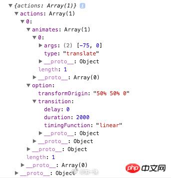
打印出赋值的`animationData`,`animates`中存放了动画事件的类型及参数;`options`中存放的是此次动画的配置选项,`transition`中存放的是`wx.createAnimation`调用时的配置,`transformOrigin`是默认配置,意为以对象的中心为起点开始执行动画,也可在`wx.createAnimation`时进行配置。
**二、音乐播放动画**
上面的模块移动动画不涉及逻辑交互,因此新尝试了一个音乐播放动画,该动画需要实现暂停、继续的效果。
**动画效果:**
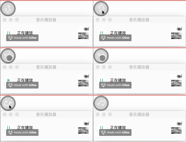
两组不同的动画效果对比,分别为`api`(上)实现与`css3`实现(下):

**代码实现**
以下分别是`css3`实现与`api`实现的核心代码:
css3:
// scss
.musicRotate{
animation: rotate 3s linear infinite;
}
@keyframes rotate{
from{
transform: rotate(0deg)
}
to{
transform: rotate(359deg)
}
}
.musicPaused{
animation-play-state: paused;
}
// js
playTwo(){
this.setData({
playTwo: !this.data.playTwo
},()=>{
let back = this.data.backgroundAudioManager;
if(this.data.playTwo){
back.play();
} else {
back.pause();
}
})
}
通过`playTwo`这个属性来判断是否暂停,并控制`css`类的添加与删除。当为`false`时,添加`.musicPaused`类,动画暂停。
api:
// js
play(){
this.setData({
play: !this.data.play
},()=>{
let back = this.data.backgroundAudioManager;
if (!this.data.play) {
back.pause();
// 跨事件清除定时器
clearInterval(this.data.rotateInterval);
} else {
back.play();
// 继续旋转,this.data.i记录了旋转的程度
this.musicRotate(this.data.i);
}
})
},
musicRotate(i){
let self = this;
let rotateFuc = function(){
i++;
self.setData({
i:i++
});
let animation = wx.createAnimation({
duration: 1000,
delay: 0,
timingFunction: "linear",
});
animation.rotate(30\*(i++)).step()
self.setData({ musicRotate: animation.export() });
}
rotateFuc();
let rotateInterval = setInterval(
rotateFuc,1000
);
// 全局定时事件
this.setData({
rotateInterval: rotateInterval
})
}
通过`api`实现的方式是通过移除`animationData`来控制动画,同时暂停动画也需要清除定时器,由于清除定时器需要跨事件进行操作,所以定了一个全局方法`rotateInterval`。
`api`方式定义了旋转的角度,但旋转到该角度之后便会停止,如果需要实现重复旋转效果,需要通过定时器来完成。因此定义了变量i,定时器每执行一次便加1,相当于每1s旋转30°,对`animation.rotate()`中的度数动态赋值。暂停之后继续动画,需要从原有角度继续旋转,因此变量i需要为全局变量。
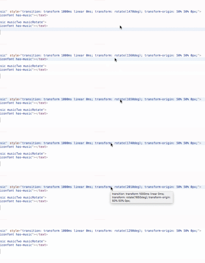
代码变化:
下图可以看出,`api`方式旋转是通过不断累加角度来完成,而非`css3`中循环执行。
**对比**
通过上述两个小例子对比,无论是便捷度还是代码量,通过`css3`来实现动画效果相对来说是更好的选择。`api`方式存在较多局限性:
1. 动画只能执行一次,循环效果需要通过定时器完成。
2. 无法按照原有轨迹返回,需要返回必须定义定时器。
3. 频繁借助定时器在性能上有硬伤。
综合以上,推荐通过`css3`来完成动画效果。
以上就是如何实现小程序动画?小程序动画的实现方法的详细内容,更多请关注知企PROSAAS其它相关文章!
**Tags:** animation, class, css, css3, dom, JS, sass, transition, 事件, 全局变量
**Categories:** 后端开发
---